AUM & Advaita: An Introduction to Nonduality
One Unit of Instruction in a Comparative Religion for Children course
By Kathy Strickland, MET Candidate, Boise State University
USER ASSUMPTIONS:
This unit of instruction titled “Aum & Advaita: An Introduction to Nonduality”—and the Comparative Religion for Children course as a whole—is intended for K-12 students who might not otherwise receive instruction in various religions. As this topic is banned in public schools, there is a need for instruction in some other context in order to provide a cultural and literary basis for key concepts and mythology from religious texts. Traditional “Sunday Schools” and programs run by religious communities tend to teach about just one religion. This course provides a well-rounded education in diverse religions without bias toward any one in particular and serves a social as well as a cognitive need for students by bringing them together to talk about ideas that they may otherwise not have the opportunity to express.
This unit is appropriate for all school-age youth, ranging from kindergarten through grade 12. While students in high school will likely generate a deeper understanding of the philosophical concepts taught, elementary students will learn and comprehend at their own level. It can’t be known in advance what will “click” or connect with individual students. The instruction will be presented in a respectful way that breaks concepts into their most basic elements without insulting any student with “babyish” language or methodology.
Students do not need a previous foundation in religious studies, but it is not detrimental to have one. In a group setting, this prior knowledge could contribute depth to class discussions, as long as every student maintains an open mind and tolerance of diverse viewpoints and beliefs.
Students should have basic literacy, but older students can help younger students with reading content they do not understand. Most instruction and discussion will be oral and visual, and writing assignments can be completed orally by the youngest students and those with special needs. Students will not be evaluated against one another, and their skills and knowledge will be considered individually relative to their age and ability. Students should have basic computer skills, and it will be beneficial for them to have the ability to conduct research online, recognize and use credible sources, and draw examples from their own lives.
GRAPHIC DESCRIPTIONS:
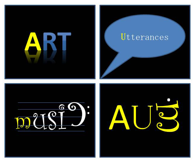
Graphic 1: Art, Utterances, and Music (Typography)
The first image I created demonstrates an abstract concept of a “sacred syllable” meaning essentially everything and breaks it down into uniquely human phenomena to which everyone can relate. Art, Utterances (i.e., literature), and Music are also often considered the highest expressions or manifestations of the divine within human beings. For the word “Art,” I used a style that reminded me of a statue or work of art reflected on a glass perch at a museum. For “Utterances,” I used a speech bubble to illustrate words—spoken or written. And for “Music,” I set the letters within a musical staff in a font representing the curves you would find in notes and clefs. The “c” itself is flipped to symbolize the bass clef, even though that would be written at the left of the staff in actual sheet music. The dot of the “i” fits as a note into the “g” space, and other serifs of the font fall where they will to compose the word and convey its meaning. The “u” in this typeface reminded me of a harp.
In my graphic, I utilized “the five tools that influence learner perception: (1) type, (2) shape, (3) color, (4) depth, and (5) space” (Lohr, 2008, p. 242). Each square uses color contrast to emphasize the first letter of the word. These three letters come together in the fourth square to create the word “AUM,” with OM as a whole represented by the “m” from the “music” block turned sideways, much as it looks in the Devanagari script of Sanskrit. This symbol is introduced at the start of Lesson 3 of this unit of instruction.

Graphics 2 and 3: Silver Dollar (Shape)
As the text explains, “circles and ovals are used to show unity” (Lohr, 2008, p.250), and that is exactly what I wanted to demonstrate here—how four separate parts constitute a whole and are therefore inseparable from it. The quarters are encompassed by the silver dollar, implying that together they are nondifferent from it, which demonstrates my central concept of advaita, or nonduality.
I still think staying with the circle theme serves my purpose better than showing four quarters sitting on top of a dollar bill, as mixing shapes would negatively impact the harmony created by the circles (Lohr, 2008, p.248) and potentially show difference or imply comparison.
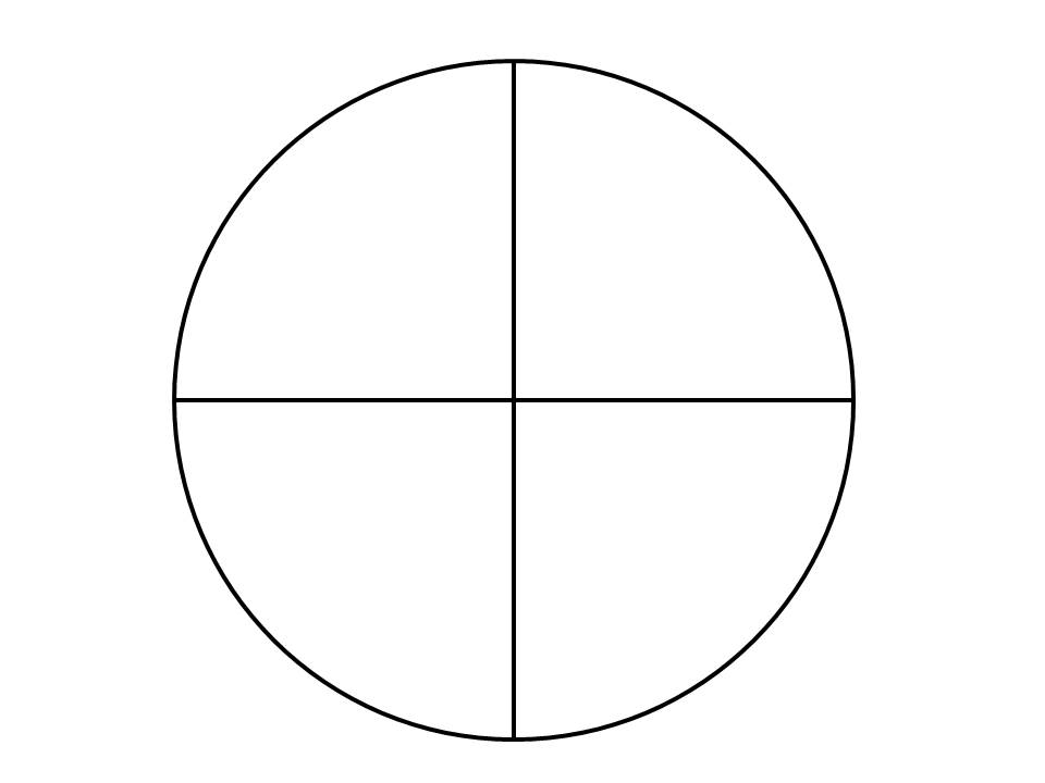
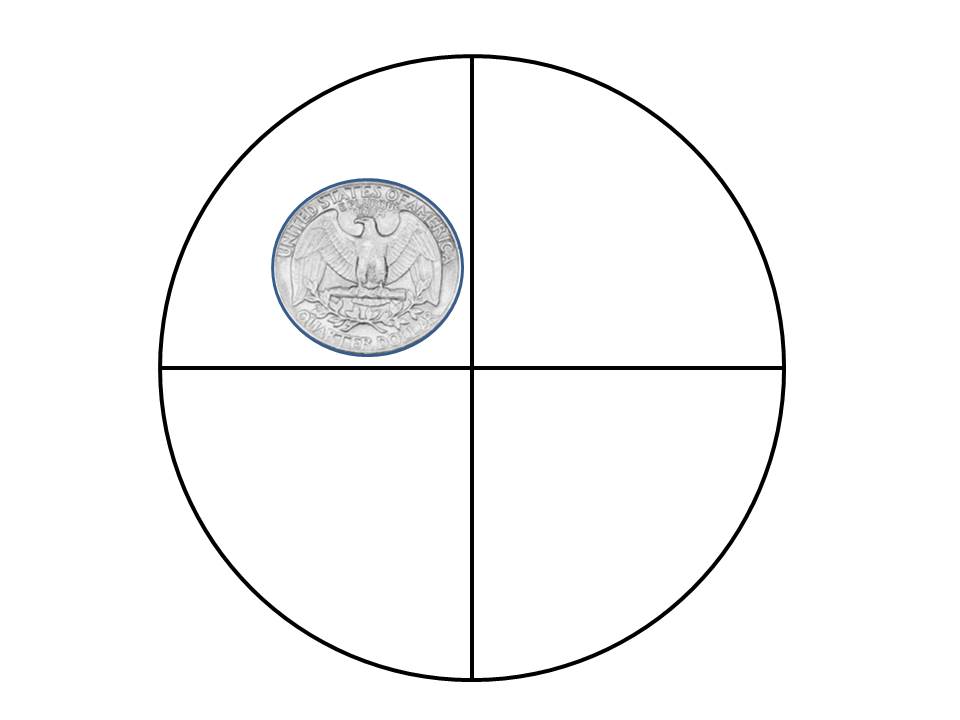
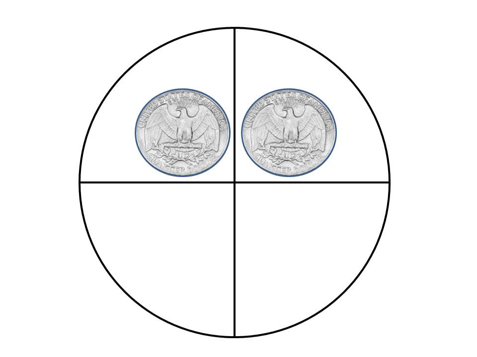
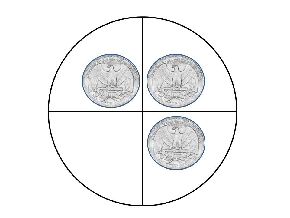
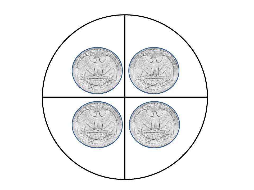
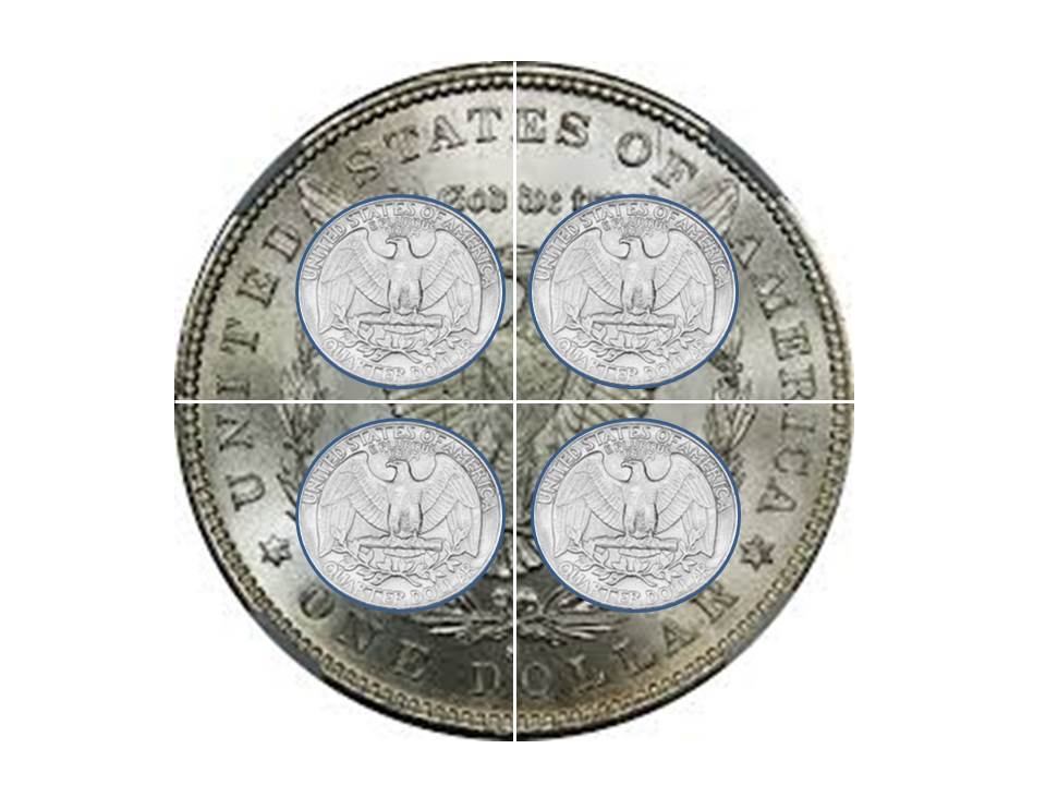
To prepare students for creating their own graphic, I created five additional graphics illustrating the steps taken to create the final silver dollar image. Both the complete silver dollar graphic and the step-by-step gallery illustration above are used in Lesson 1 of this unit of instruction. Students' ideas might include a pizza cut into slices, four quarts in a gallon of milk, etc.
|
|
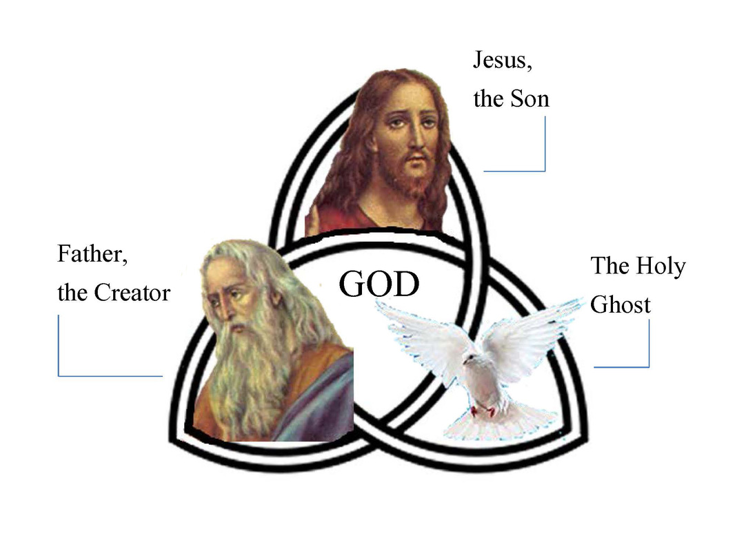
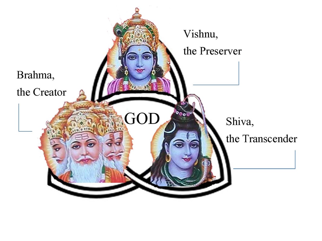
Graphic 4: Holy Trinity (CARP)
This graphic shows the similarities between the Christian Trinity and the Hindu Trimurti. As Saint Patrick illustrated with a three-leaved shamrock, we don’t see the leaves and think of them as separate; rather, we see them as one plant. But in these illustrations, I wanted to make each element of the trinity visible, while also indicating unity through the use of a Venn diagram.
Using the four “action elements” of CARP (contrast, alignment, repetition and proximity), I set out to show in my graphic how the Christian and Hindu trinities are parallel, differing only in name (Father/Brahma, Son/Vishnu, and Holy Ghost/Shiva) and appearance (how these characters are portrayed in art). I employed these action elements in the following ways:
- Contrast: Overall, these graphics strive to show similarities vs. differences. However, if one thinks of contrast in the sense of coherence and excluding extraneous information (Lohr, 2008, p. 199), then I believe I have achieved this by including only the basic, most recognizable names of each aspect of the trinity and labeling the middle as simply “God.”
- Alignment: Alignment is a key action element within and across these two graphics. The images are shown in the same order in each graphic (Father/Creator, Son/Preserver, then Holy Ghost/Transcender), and labels are aligned accordingly. The Word “God” is aligned in the center of each.
- Repetition: I repeat key words in my graphics (Creator, God) and repeat the shape of the Venn diagram. I also use the same typeface in each graphic.
- Proximity: Each of the three elements in each graphic lies is in the same general proximity to the unifying element in the center: the word “God.” I made sure to overlap the image in each of the three intersecting cells in such a way that they would carry equal weight and value. I hope that I have achieved the sense that, visually, these elements are related but, as the white space in the middle indicates, still distinct components (Lohr, 2008, p. 207).
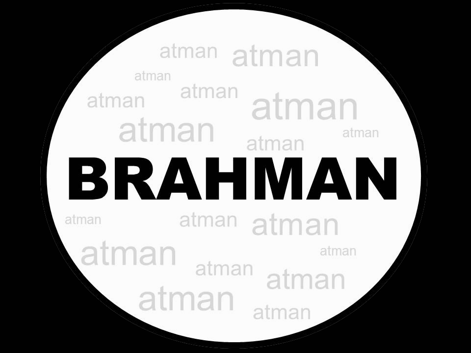
Graphic 5: Atman/Brahman (Selection)
This graphic really gets to the heart of my unit’s theme of nonduality. By using the selection principle and the concept of figure-ground, I was able to illustrate the key concept in Advaita Vedanta of the integral nature of Atman, the “individual” self or soul, and Brahman, which is everywhere and inside of each living being. The Sanskrit phrase “Tat Tvam Asi,” originally appearing in the Chandogya Upanishad and translated as “That Art Thou,” means that the Atman is, in reality, no different from the Brahman.
I chose to emphasize the word “Brahman” by setting it in big, bold type as the figure of the graphic. The word “Atman” is repeated many times in a much lighter typeface in the background, indicating that there are many “individual souls” comprising the whole. The contrast of light and dark helps emphasize the key concept, and the boldness of the black around the circle is meant to connect visually to the word “Brahman” and to represent how that ultimate reality extends beyond the boundaries of the circle.
The concept of “That Art Thou” is similar to the idea of a world spirit, or Weltgeist in German, which philosopher Georg Wilhelm Friedrich Hegel weaves into his explanation of “absolute idealism,” presenting the thinker and the thought—the subject and the object—as nonseparate.
Another German word, gestalt, loosely translated as “configuration,” appeared in this week’s readings, and the Gestalt Theory further illustrates the concept of an all-inclusive whole:
Max Wertheimer explained Gestalt Theory: “The fundamental 'formula' of Gestalt theory might be expressed in this way: There are wholes, the behavior of which is not determined by that of their individual elements, but where the part-processes are themselves determined by the intrinsic nature of the whole. It is the hope of Gestalt theory to determine the nature of such wholes.” (Graham, 2008, p. 1)
My graphic is a solid example of figure-ground, “the fundamental law of gestalt that helps us identify objects (figure) as distinct from their background (ground). This law of perception is dependent upon contrast” (Graham, 2008, p. 3).
Contrast plays a major role in the graphic I designed. The bold, black type of the word “Brahman” and the black background tie together visually as simultaneously inside and outside the circle. This contrasts with the light, gray type of the smaller words (atman), which are confined to the inside of the circle—but only because people think of themselves as separate from the ultimate reality of Brahman. I believe I have succeeded in delivering an optimal figure-ground balance by creating “a clear distinction between the figure and the ground” and “helping learners by doing some of the brainwork for them” (Lohr, 2008, p. 108). Perhaps ironically, that distinction is ultimately an example of the unity of the whole.
This graphic appears in Lesson 1 of my instruction.
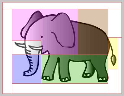
Graphic 6: Elephant (Color)
This graphic illustration is based on a proverb that most likely originated in an ancient Buddhist scripture about six blind men and an elephant. Each blind man felt a different part of the elephant and deduced that it was something other than what his fellow blind men concluded. If my graphic were working correctly outside of Fireworks, the learner would click on each colored segment to see what each blind man thought that particular part to be.
The concept for this graphic came from a jigsaw lesson I created for EdTech 502). Instead of a science lesson, however, this graphic would be used as part of a course in Comparative Religion for Children. The purpose of this graphic in Lesson 2 of the unit on nonduality is to help students visualize how parts can be misinterpreted, mislabeled, and misunderstood when taken out of context of the whole. My primary reason for using color was to label the different parts and differentiate information (Lohr, 2008, p. 265).
Related to my graphic, other research-based advantages for using color—as outlined by Misanchuk, Schwier, and Boling (2000) in the text—include the ability to:
To support this lesson, I came up with another graphic while designing the instructional website. Please see Lesson 2 to view this supporting graphic—and its parts—in context.
This graphic illustration is based on a proverb that most likely originated in an ancient Buddhist scripture about six blind men and an elephant. Each blind man felt a different part of the elephant and deduced that it was something other than what his fellow blind men concluded. If my graphic were working correctly outside of Fireworks, the learner would click on each colored segment to see what each blind man thought that particular part to be.
The concept for this graphic came from a jigsaw lesson I created for EdTech 502). Instead of a science lesson, however, this graphic would be used as part of a course in Comparative Religion for Children. The purpose of this graphic in Lesson 2 of the unit on nonduality is to help students visualize how parts can be misinterpreted, mislabeled, and misunderstood when taken out of context of the whole. My primary reason for using color was to label the different parts and differentiate information (Lohr, 2008, p. 265).
Related to my graphic, other research-based advantages for using color—as outlined by Misanchuk, Schwier, and Boling (2000) in the text—include the ability to:
- Locate information
- Aid in differentiation and discrimination among elements
- Facilitate identification (Lohr, 2008, p. 266)
To support this lesson, I came up with another graphic while designing the instructional website. Please see Lesson 2 to view this supporting graphic—and its parts—in context.
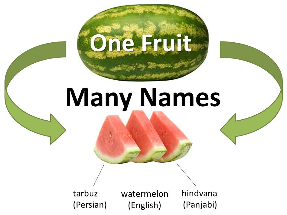
Graphic 7: Watermelon (Organization)
This graphic illustrates a story told by Svami Rama Tirtha as part of a lecture titled “The Secret of Success” on January 26, 1903, in the Golden Gate Hall in San Francisco (Tirtha, 1903). The tale is of three boys who are given a dollar and quarrel over what they will buy with it. In the story, there is an English boy, a Persian boy, and a Panjabi boy who do not realize that they all want the same thing (a watermelon to share) until someone points out to them that they are all asking for that same fruit but in different languages. I debated using different languages representing different religions, including Hindi/Hinduism, Spanish/Christianity, and Japanese/Buddhism. However, I ultimately decided to stick with the original languages in keeping with the script I built into Lesson 2 of this unit of instruction.
The task for this assignment was to create an image that uses words and symbols to imply hierarchy. I feel that I have achieved hierarchy with both size and placement of images and text. It is clear that the three slices are but portions of the whole watermelon, and likewise that the labels are simply three of many translations for the same fruit with many names. After all, “What’s in a name? That which we call a rose by any other name would smell as sweet” (Shakespeare & Durband, 1985).
The whole watermelon at the top acts as an entry point to the graphic. This vertical alignment demonstrates how, “in general, items on the top are assigned a status of more importance” (Lohr, 2008, p. 128). The slices of the watermelon are clustered, or chunked, into a related group, which indicates that they are equal parts of the whole (Lohr, 2008, p. 125). The arrows encompassing the graphic in the color of the whole watermelon are meant to show that the slices and their associated terms are part of the whole—and thus to illustrate the key concept of nonduality.
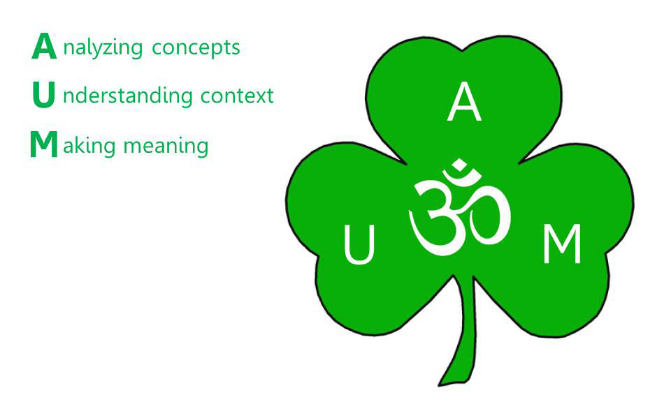
Graphic 8: Shamrock (White Space)
As the text suggests, good instructional design marries words and images to make meaning, and white space plays a key role in the presentation. For this graphic, I used the principle of asymmetry, “a visual arrangement in which elements appear to be thrown off balance,” to present both textual and visual elements in a way that tends to achieve more visual interest than a symmetrical design (Lohr, 2008, p. 275).
I originally intended for this graphic to be presented in Lesson 1 as both a way to introduce the organization of the instruction and to illustrate the key concept of nonduality. As described in the next section on Design Process, it evolved into much more than that, and I ended up using it as a way to introduce every lesson.
Consider first the organizational purpose. The lessons of the unit are represented in the three leaves of the shamrock as:
I hope that I have achieved “a good balance between the white space and the other elements that make up the visual” (Lohr, 2008, p. 275), and that the text at left, which alternates in the website depending on which lesson the user is on, adds to the graphic’s meaning and purpose.
DESIGN PROCESS:
When I began designing my lesson pages, I realized that the shamrock graphic I originally created to introduce the unit during Lesson 1 actually made sense as a common thread throughout the instructional website. On the home page I used the shamrock to introduce the three lessons, with all three lesson topics shown. For the individual lesson pages, I decided to highlight only that lesson in the list of topics—and incorporated the shamrock into the introductory explanation of each lesson, as the image itself represents the core concept of nonduality.
Throughout the website I used concept learning strategies—such as graphic representations (including those described in the previous section), analogies, mnemonics, and imagery (Smith & Ragan, 2005, pp. 178-179). This was all content I originally planned and created using a lesson plan template based on the model recommended in Preparing to Use Technology: A Practical Guide for Technology Integration (Bannon & Puckett, 2010). I wrote objectives with consideration to the strong verbs and tiered levels outlined in the revised Bloom’s Taxonomy (Anderson et al., 2001).
The content evolved as I placed it online using Weebly, a simple website creation tool. The need for logical navigation quickly became clear. At the top of each page, I included a Return Home button. On the lesson pages, I also included a button linking to the full lesson plan. (The lesson plan is intended as an additional resource and is not student-facing.) From the lesson plan page, I included a Return to Lesson button to make it easy for instructors to navigate back and forth from the actual online instruction and the lesson plan.
With Lesson 2, the nature of the supporting graphic I created to illustrate the importance of looking at parts in the context of the whole made it necessary to split the instruction into two pages. At the bottom of the first web page, two cropped images are introduced, and students are asked what they see. The students then click on a button to go to the next page, which reveals the big picture containing the two images—and thus the reality of what they were seeing. I have many ideas for more graphics to use in this way, including an elephant’s tusk that appears to be a spear when a person is running from it; an elephant’s ear that appears to be a fan when a person is sweating next to it; and an elephant’s trunk that appears to be a snake when a snake charmer is playing to it. I would like to create these graphics as time allows.
It was also necessary to create a banner for each page on the website to make it immediately clear what section or lesson the user is in. I used the yin yang symbol in each banner for consistency so people knew they were still in the same website. The yin yang is also a representation of the concept of nonduality and dynamic balance, with “yang” referring to sunlight in the daytime, and “yin” being the lack of sunlight at night—you can’t have one without the other.
The website—and the instruction itself—took on a life of its own, which was a joy to experience.
REFERENCES:
Anderson, L.W. (Ed.), Krathwohl, D.R. (Ed.), Airasian, P.W., Cruikshank, K.A., Mayer, R.E., Pintrich, P.R., Raths, J., & Wittrock, M.C. (2001). A taxonomy for learning, teaching, and assessing: A revision of Bloom’s Taxonomy of Educational Objectives. New York: Longman.
Bannon, B., & Puckett, K. (2010). Preparing to use technology: A practical guide to curriculum integration (2nd ed.). Boston: Pearson.
Graham, L. (2008). Gestalt theory in interactive media design. Journal of Humanities & Social Sciences, 2(1).
Lohr, L. (2008). Creating graphics for learning and performance: Lessons in visual literacy (2nd ed.). Upper Saddle River, NJ: Pearson/Merrill/Prentice Hall.
Shakespeare, W., & Durband, A. (1985). Romeo and Juliet. Woodbury, N.Y: Barron’s.
Smith, P. L., & Ragan, T. J. (2005). Instructional design. Hoboken, N.J: J. Wiley & Sons.
Tirtha, R. (1903, January). The secret of success. Symposium conducted at Golden Gate Hall, San Francisco, CA.
As the text suggests, good instructional design marries words and images to make meaning, and white space plays a key role in the presentation. For this graphic, I used the principle of asymmetry, “a visual arrangement in which elements appear to be thrown off balance,” to present both textual and visual elements in a way that tends to achieve more visual interest than a symmetrical design (Lohr, 2008, p. 275).
I originally intended for this graphic to be presented in Lesson 1 as both a way to introduce the organization of the instruction and to illustrate the key concept of nonduality. As described in the next section on Design Process, it evolved into much more than that, and I ended up using it as a way to introduce every lesson.
Consider first the organizational purpose. The lessons of the unit are represented in the three leaves of the shamrock as:
- A: Analyzing Concepts--In the first lesson we explore how a thing, though composed of many parts, is considered as a whole.
- U: Understanding Context—In the second lesson we explore how the essence of a thing can be confused when its parts are viewed out of context of the whole.
- M: Making Meaning--In the third lesson we examine the concept of advaita (nonduality or nondifference) in the contexts of Hinduism and other religions and make our own connections.
I hope that I have achieved “a good balance between the white space and the other elements that make up the visual” (Lohr, 2008, p. 275), and that the text at left, which alternates in the website depending on which lesson the user is on, adds to the graphic’s meaning and purpose.
DESIGN PROCESS:
When I began designing my lesson pages, I realized that the shamrock graphic I originally created to introduce the unit during Lesson 1 actually made sense as a common thread throughout the instructional website. On the home page I used the shamrock to introduce the three lessons, with all three lesson topics shown. For the individual lesson pages, I decided to highlight only that lesson in the list of topics—and incorporated the shamrock into the introductory explanation of each lesson, as the image itself represents the core concept of nonduality.
Throughout the website I used concept learning strategies—such as graphic representations (including those described in the previous section), analogies, mnemonics, and imagery (Smith & Ragan, 2005, pp. 178-179). This was all content I originally planned and created using a lesson plan template based on the model recommended in Preparing to Use Technology: A Practical Guide for Technology Integration (Bannon & Puckett, 2010). I wrote objectives with consideration to the strong verbs and tiered levels outlined in the revised Bloom’s Taxonomy (Anderson et al., 2001).
The content evolved as I placed it online using Weebly, a simple website creation tool. The need for logical navigation quickly became clear. At the top of each page, I included a Return Home button. On the lesson pages, I also included a button linking to the full lesson plan. (The lesson plan is intended as an additional resource and is not student-facing.) From the lesson plan page, I included a Return to Lesson button to make it easy for instructors to navigate back and forth from the actual online instruction and the lesson plan.
With Lesson 2, the nature of the supporting graphic I created to illustrate the importance of looking at parts in the context of the whole made it necessary to split the instruction into two pages. At the bottom of the first web page, two cropped images are introduced, and students are asked what they see. The students then click on a button to go to the next page, which reveals the big picture containing the two images—and thus the reality of what they were seeing. I have many ideas for more graphics to use in this way, including an elephant’s tusk that appears to be a spear when a person is running from it; an elephant’s ear that appears to be a fan when a person is sweating next to it; and an elephant’s trunk that appears to be a snake when a snake charmer is playing to it. I would like to create these graphics as time allows.
It was also necessary to create a banner for each page on the website to make it immediately clear what section or lesson the user is in. I used the yin yang symbol in each banner for consistency so people knew they were still in the same website. The yin yang is also a representation of the concept of nonduality and dynamic balance, with “yang” referring to sunlight in the daytime, and “yin” being the lack of sunlight at night—you can’t have one without the other.
The website—and the instruction itself—took on a life of its own, which was a joy to experience.
REFERENCES:
Anderson, L.W. (Ed.), Krathwohl, D.R. (Ed.), Airasian, P.W., Cruikshank, K.A., Mayer, R.E., Pintrich, P.R., Raths, J., & Wittrock, M.C. (2001). A taxonomy for learning, teaching, and assessing: A revision of Bloom’s Taxonomy of Educational Objectives. New York: Longman.
Bannon, B., & Puckett, K. (2010). Preparing to use technology: A practical guide to curriculum integration (2nd ed.). Boston: Pearson.
Graham, L. (2008). Gestalt theory in interactive media design. Journal of Humanities & Social Sciences, 2(1).
Lohr, L. (2008). Creating graphics for learning and performance: Lessons in visual literacy (2nd ed.). Upper Saddle River, NJ: Pearson/Merrill/Prentice Hall.
Shakespeare, W., & Durband, A. (1985). Romeo and Juliet. Woodbury, N.Y: Barron’s.
Smith, P. L., & Ragan, T. J. (2005). Instructional design. Hoboken, N.J: J. Wiley & Sons.
Tirtha, R. (1903, January). The secret of success. Symposium conducted at Golden Gate Hall, San Francisco, CA.
